The Complete Guide to Capsule Colours: What Each Colour Means for Your Brand
When a patient picks up a medicine, the capsule's colour is the first thing they see — before they read the label, before they think about the dose. That first visual impression carries real psychological weight. For pharmaceutical manufacturers and nutraceutical brands, capsule colour is not a cosmetic afterthought. It is a deliberate tool for brand building, patient compliance, and market positioning.
This guide from Universe Capsules, a hard gelatin capsule manufacturer in India, explains the psychology of capsule colour, what different colours communicate to patients and prescribers, and how to choose the right colour combination for your product.
Interactive capsule colour explorer
Select a cap colour and a body colour to preview your capsule combination and see what it communicates.
Select colours above
Choose a colour combination to see its meaning and common applications.
Why capsule colour matters scientifically
The link between colour and patient perception has been studied extensively in pharmacology. A landmark study published in the journal Social Science & Medicine found that patients consistently rated red and orange capsules as more stimulating and potent, while blue and green were associated with sedative or calming effects. White capsules were perceived as neutral and clinical — appropriate for serious medications.
These associations are not universal across all cultures, but they are consistent enough across pharmaceutical markets in South Asia, the Middle East, and Africa that they are worth considering during brand development. A high-potency antibiotic in a pale pastel capsule may face compliance issues simply because the colour doesn't match the patient's expectation of a strong medicine.
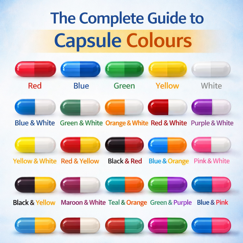
The colour psychology reference guide
White
Clinical, neutral, trusted. Most widely used in pharma. Perceived as pure and safe. Ideal for: antibiotics, analgesics, vitamins.
Yellow / ivory
Warm and approachable. Common in nutraceuticals and energy supplements. Perceived as mild and friendly.
Orange
Energising, stimulating. Popular for sports nutrition and high-dose supplements. Associated with vitality.
Red
Potent, urgent, powerful. Used for high-strength formulations and cardiac medications. High brand recall.
Blue
Calming, reliable, professional. Used for antihypertensives, sleep aids, and trusted OTC brands. Globally trusted colour.
Green
Natural, herbal, wellness. Dominant in Ayurvedic and herbal product ranges. Strong association with nature and health.
Black / dark
Premium, specialised, distinctive. Used for activated charcoal products and premium supplement brands. High visual impact.
Metallic / gold
Luxury, premium, high-value. Growing use in premium supplement exports to Gulf and European markets. Instantly differentiates on shelf.
Choosing a two-tone colour combination
Most capsules use a two-tone colour scheme — a different colour for the cap and the body. This serves several purposes: it makes the product visually distinctive, creates brand recognition, and can signal product variants within a product range (e.g. 250 mg in blue/white, 500 mg in red/white).
| Cap | Body | Common application | Market association |
|---|---|---|---|
| Red | White | Antibiotics, high-dose APIs | India, Middle East OTC |
| Blue | White | Antihypertensives, OTC analgesics | Global, trusted |
| Green | White | Herbal, Ayurvedic, digestive health | India, Southeast Asia |
| Yellow | White | Vitamins, immunity supplements | Nutraceuticals, Africa |
| Black | White | Activated charcoal, premium supplement | Premium export markets |
| Metallic gold | White | Premium nutraceuticals, wellness brands | Gulf, Europe |
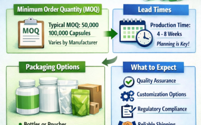
Regulatory considerations for capsule colour
While colour choice is largely a brand decision, there are regulatory angles to consider. In some markets, colour-coding of capsules is used as a safety standard — for example, to distinguish between different strengths of the same product. If you are launching in multiple strengths, plan your colour scheme across the full range from the start to avoid conflicts during regulatory submission.
All colouring agents used in capsule manufacturing must be approved for use in oral pharmaceutical products in the destination market. Universe Capsules uses only pharmacopoeia-approved colorants meeting IP, BP, and international standards.
Need capsules in a specific colour combination?
Universe Capsules manufactures empty hard gelatin capsules in a wide range of standard and custom colour combinations, including metallic and pearl finish shells. We supply pharmaceutical manufacturers and nutraceutical exporters across India, the Middle East, and Africa.
Frequently Asked Questions
Does capsule colour affect patient compliance?
Yes. Research shows capsule colour influences patient perception of a drug's potency and effect. Consistent colour branding also improves patient recognition and reduces dosing errors in multi-drug regimens.
Can I choose any colour combination for my capsules?
Hard gelatin capsules can be made in hundreds of cap-and-body colour combinations. Universe Capsules produces standard and custom colours including metallic and pearl finishes. Custom Pantone or RAL colour matching is available for established brands.
Are capsule colour pigments safe for pharmaceutical use?
Yes. Only pharmacopoeia-approved colorants compliant with IP, BP, and international standards are used. All Universe Capsules colouring agents meet regulatory requirements for oral pharmaceutical dosage forms.
What is the most popular capsule colour combination?
White/white is most common for plain pharmaceutical use. For nutraceuticals, green/white, blue/white, and red/yellow are popular. Premium brands increasingly use metallic or pearl finish shells for export markets.